Dashboard wireframes are high-fidelity blueprints that visually map out the layout and key elements of a dashboard. They act as a foundation for the design and development process, helping stakeholders and designers visualize the functionality and information flow before delving into detailed design and coding.
Why should you embrace user-centered design?
- UCD makes your dashboard more accessible and usable.
- User-centricity increases your dashboard’s efficiency, saving everyone time.
- It lowers the development costs, because it helps you avoid rework.
- Your brand will gain user loyalty.
Why Are Dashboard Wireframes Important?

Dashboard wireframes streamline the design process. The visualizations ensure that all team members are on the same page each step of the way, facilitate quick creation and adjustments, allow teams to establish priorities and preventively diminish errors.
Communicating early
Wireframes facilitate clear communication between designers, developers and stakeholders by establishing a shared understanding of the dashboard’s purpose, content and user experience.
iterating rapidly
This type of design allows for quick and easy design adjustments, enabling you to test different layouts and functionalities before investing time and resources into high-fidelity mockups.
Focusing on Functionality
By focusing on information hierarchy and user interaction, wireframes help prioritize functionality over aesthetics, ensuring the dashboard actually meets user needs.
Reducing Development Costs
Early identification and resolution of potential issues through wireframing leads to smoother development and potentially minimizes errors and rework later in the process.
The Purpose of User-Centered Design
The purpose of user-centered design is to create products, services and experiences that are usable, enjoyable and effective for the people who use them. It’s all about putting the user at the heart of the design process and making sure that their needs, goals and frustrations are understood and addressed. Here are some key benefits of using UCD.
Increased usability
UCD ensures that products are easy to understand and use, which leads to higher user satisfaction and adoption.
Improved efficiency
When users can easily find what they need and complete tasks quickly, it saves them time and frustration.
Reduced development costs
By identifying and addressing usability issues early in the design process, companies can avoid costly rework later on.
Stronger brand reputation
Enjoyable and effective products can build positive word-of-mouth and loyalty among users.
Wireframing Tools and Techniques

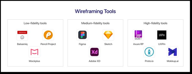
Wireframing tools come in various flavors, each catering to different tastes, needs and budgets. Here are some popular options, categorized by their key strengths.
- Low-fidelity tools prioritize speed and simplicity, ideal for rapid ideation and brainstorming. Some examples include Balsamiq, Pencil Project and Mockplus.
- Medium-fidelity tools offer a balance between simplicity and detail, good for refining ideas and getting stakeholder buy-in. Think Figma, Sketch or Adobe XD.
- High-fidelity tools create more polished and interactive wireframes, and are excellent for detailed user testing and presentation. Check out tools like Axure RP, UXPin, Proto.io and Mokkup.ai.

Beyond the tool you choose, mastering some core techniques will elevate your wireframing skills. For instance, try to focus on content and functionality over aesthetics at this stage by prioritizing user flow, information hierarchy and element placement. Use basic shapes and placeholder text to avoid cluttering the layout — clarity is key.
Additionally, most tools offer pre-built UI elements to save time and maintain consistency, so you can use those templates and libraries to your advantage. Even basic prototypes can reveal usability issues and guide design decisions, so prototyping early and often can save you lots of time.
Feedback and Iteration

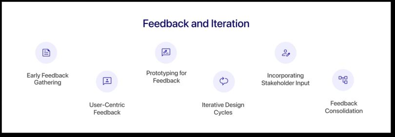
Feedback and iteration are critical components of the design process, playing a crucial role in refining and enhancing a design solution. I make sure to implement the following methods from the beginning.
Gathering internal Feedback Early
You should initiate the feedback loop early in the design process to identify potential issues and gather initial impressions, and encourage open communication within the team and among stakeholders to foster a collaborative feedback culture.
Listening to User Feedback
To stay on the same page as your users, you’ll need to prioritize feedback from end users to ensure that the design meets their needs and expectations. This involves conducting usability testing and user interviews to gather qualitative insights into user experiences.
Prototyping for Feedback
Another good way to facilitate feedback is by creating prototypes or mockups to provide tangible representations of the design for feedback. You can use high-fidelity prototyping tools to quickly iterate and modify design elements based on early feedback.
creating Iterative Design Cycles
Adopting an iterative design approach where designs are refined through multiple cycles of feedback and improvement can help you stay on the ball during the design process. This looks like continuously refining and iterating on the design based on insights gained from user testing, stakeholder input and team collaboration.
Incorporating Stakeholder Input
Before getting too far in any project, you’ll want to seek feedback from various stakeholders, including clients, project managers and team members to ensure alignment with project goals. Creating a design that satisfies both business objectives and end-user needs requires balancing stakeholder input with user feedback.
consolidating feedback
The final step is aggregating and consolidating feedback to identify common themes, prioritize design adjustments and organize feedback into actionable insights to guide the next steps in the design process.
The User-Centered Design Blueprint
Decoding dashboard wireframes reveals the intricate blueprint that underlies user-centered design, embodying a commitment to creating interfaces that seamlessly align with user needs and expectations. Through exploring key components, collaborative design processes and feedback and iteration, we’ve uncovered the essence of crafting intuitive and engaging dashboards.
User-centered design prioritizes usability and celebrates end users’ diversity, promoting inclusivity and accessibility. The art and science of decoding dashboard wireframes are essential in the continuous pursuit of elevating user experiences, ensuring that each interaction leaves a lasting and positive impression.


