Breadcrumbs, also known as a breadcrumb trail, are a secondary navigation system that shows a user’s location in a site or web app. The term came from the Hansel and Gretel fairy tale in which the main characters create a trail of breadcrumbs to track back to their house. Just like the children in the story, visitors need to know their location in a site’s hierarchical structure.
In this article, we’ll learn why breadcrumbs are so important, explore different types of breadcrumbs and discuss some best practices for applying breadcrumb trails to your website.
What Are Breadcrumbs and How Do They Help Navigate a Website?
Why Breadcrumb Navigation Is So Valuable
Breadcrumbs act as a visual aid that indicates the user’s location within the site’s hierarchy. Breadcrumb navigation is a great source of contextual information for users that help them to find answers to the following questions:
Where am I?
Breadcrumbs inform visitors of their current location in relation to the entire site hierarchy.
Where can I go?
Breadcrumbs improve the findability of content for website visitors. Users don’t need to click on the menu to find available navigation options; they see the site’s structure because it is laid out in breadcrumbs. As a result, breadcrumbs encourage browsing. For example, an e-commerce site visitor might land on a product page, and even if the first product isn’t a good match, the visitor might want to view other products from the same category.
Breadcrumbs also offer two other major benefits. First of all, they take up minimal space. They’re a compact mechanism that takes a minimum amount of page space: just a row of text with links. As a result, it doesn’t introduce extra visual distractions to visitors. Further, users are familiar with breadcrumbs. Breadcrumbs have existed from the very beginning of the internet, so people don’t have any trouble interacting with them.
When Should You Use Breadcrumbs?
To understand if your site would benefit from adding breadcrumbs, you first need to create a map that shows its navigation structure and then analyze it. Breadcrumbs can improve the user’s ability to navigate when you have a significant amount of content organized in a hierarchical manner (i.e., multiple sections that can be divided into more subsections). A good example is an e-commerce site that offers a variety of products grouped into categories.
Avoid using breadcrumbs when you have a single-level website with no logical hierarchy or grouping. For example, breadcrumbs are unnecessary for a personal blog.
Breadcrumbs can be organized on the basis of location, path or attribute.
1. Location-Based Breadcrumbs
Location-based breadcrumbs are the most common type. They represent a site’s structure, and they help visitors understand and navigate your multilevel site’s hierarchy. This type of breadcrumb is helpful for visitors who landed on your site from Google search results.

In the example below from Best Buy’s website, each text link is for a page that is one level higher than the one on its right.

2. Path-Based Breadcrumbs
Path-based breadcrumbs show the entire path the user went through on the website to reach a particular page. This type of breadcrumb is dynamically generated. Although path-based breadcrumbs can be helpful in specific contexts (i.e., when the user needs to see their journey).
Most of the time, this type isn’t very useful because visitors tend to navigate from one page to another, and the trail they create can be very chaotic. When users want to go back to the previous pages they’ve visited, they tend to rely on the back button in their browsers. A path-based trail is useless for visitors who landed from the Google search results directly at a page deep within the site.
Below is an example of path-based breadcrumb links that show two paths to navigate to the target page.

3. Attribute-Based Breadcrumbs
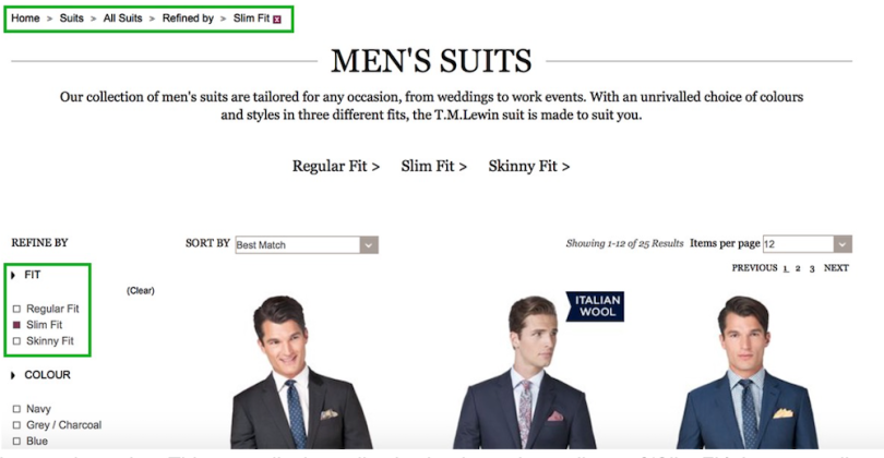
Attribute-based breadcrumbs list the categories to the specific page or product. On e-commerce websites, this type can help visitors understand the difference between particular product variations.

For example, on T.M. Lewin’s site, breadcrumb trails show the attributes of the items displayed on a particular page:

Breadcrumb Navigation Best Practices
When designing breadcrumb navigation, keep the following principles in mind:
1. Don’t use breadcrumbs as a replacement for primary navigation
Breadcrumb navigation is an extra feature that aids navigation, but it shouldn’t serve as a replacement for primary navigation menus. Think of breadcrumbs as an alternative way to navigate your website. Here, Apple uses breadcrumbs to support the main navigational tools.

2. Don’t add links to the current page in breadcrumbs
The last item in the breadcrumb trail, which shows the user’s current location, is optional. If you want to display it, make sure it’s not clickable. Since users are already on the page, it doesn’t make sense to add a link leading to the current page to the breadcrumb navigation.
3. Use clear visual separators between individual levels
The most recognizable symbol for separating links in breadcrumb trails is the greater than symbol (>). The > sign is the most conventional indicator that denotes hierarchy, as in the Parent category > Child category format. Other common symbols are arrows pointing to the right (→) and slashes (/ or //). The choice of visual separator depends on the aesthetics of the site and the type of breadcrumb.
4. Choose a proper visual style for breadcrumbs
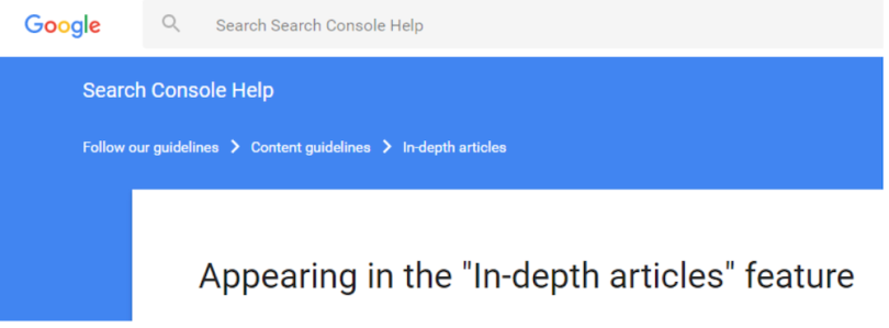
You don’t want your breadcrumbs to dominate the page. They should be less prominent than the primary navigation menu. A rule of thumb to follow when sizing and styling your breadcrumb trail is that it shouldn’t be the first item that grabs the user’s attention when they land on a page. Here, the Google Support page doesn’t make its breadcrumb navigation look fancy, but users can quickly locate and use it.

Use Breadcrumbs to Help Users Find Their Paths
Good navigation experience is an integral property of good product design. Breadcrumbs enhance usability and make interaction with a website more comfortable because they make it easier for visitors to move around the site.


